Branding Identity
Win over your customers with a high-performance logo and a powerful branding strategy.
Portfolio
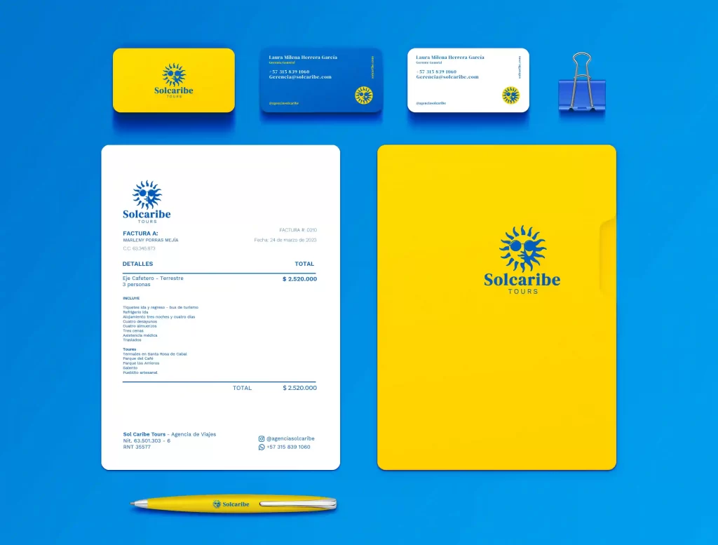
Sol Caribe Tours
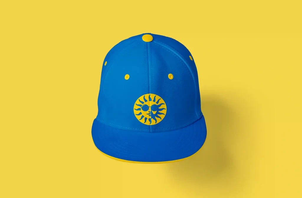
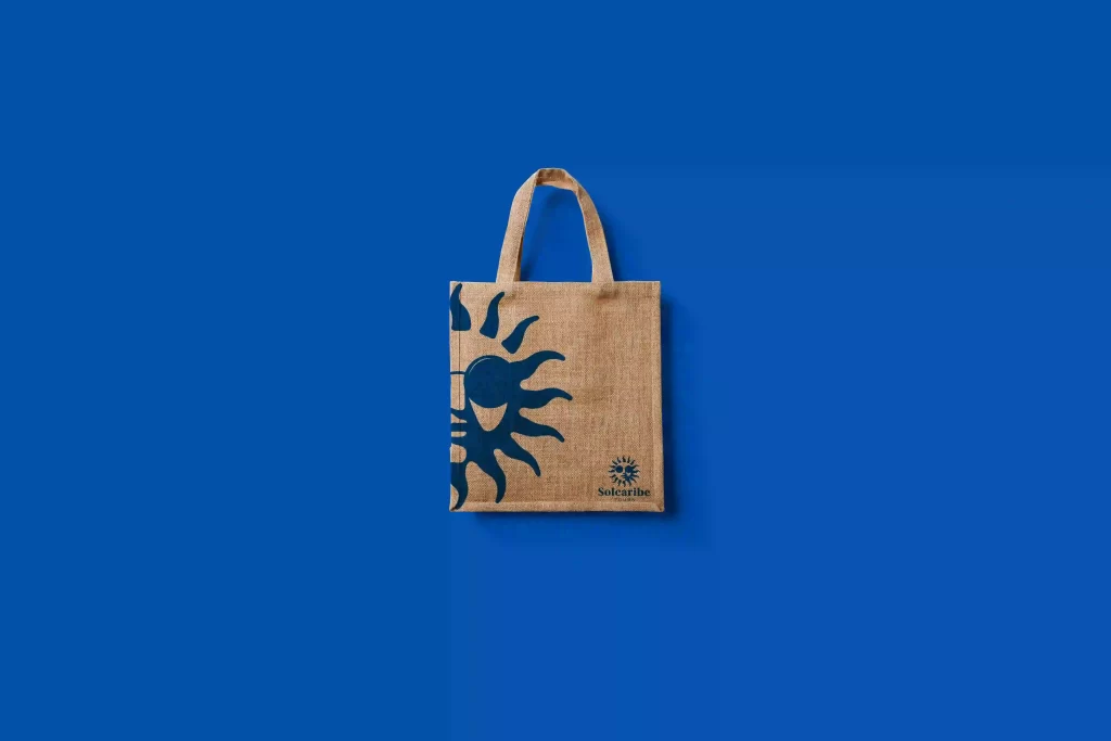
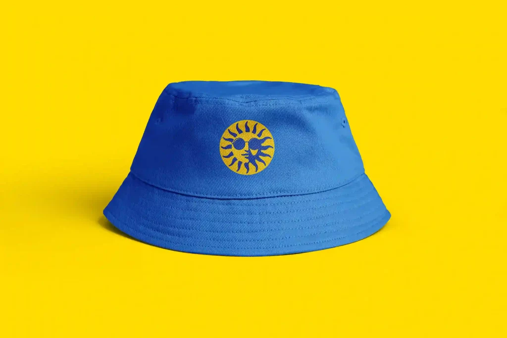
For the redesign of this brand, the challenge was to convert a conventional symbol into a high-performance logo with high graphic quality, since the history of this symbol in the company was 8 years and could not be changed. So it was decided to keep it and completely transform it giving a completely different, unique and professional finish.
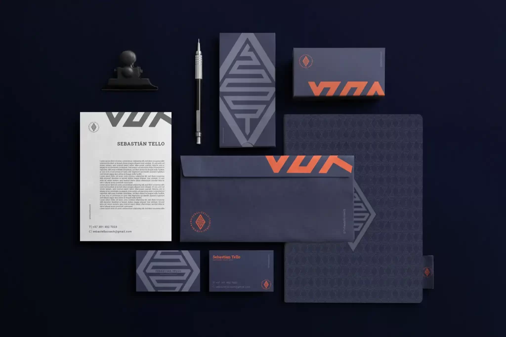
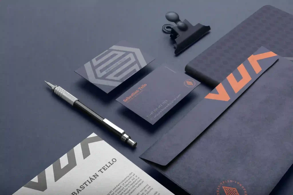
Sebas Tello
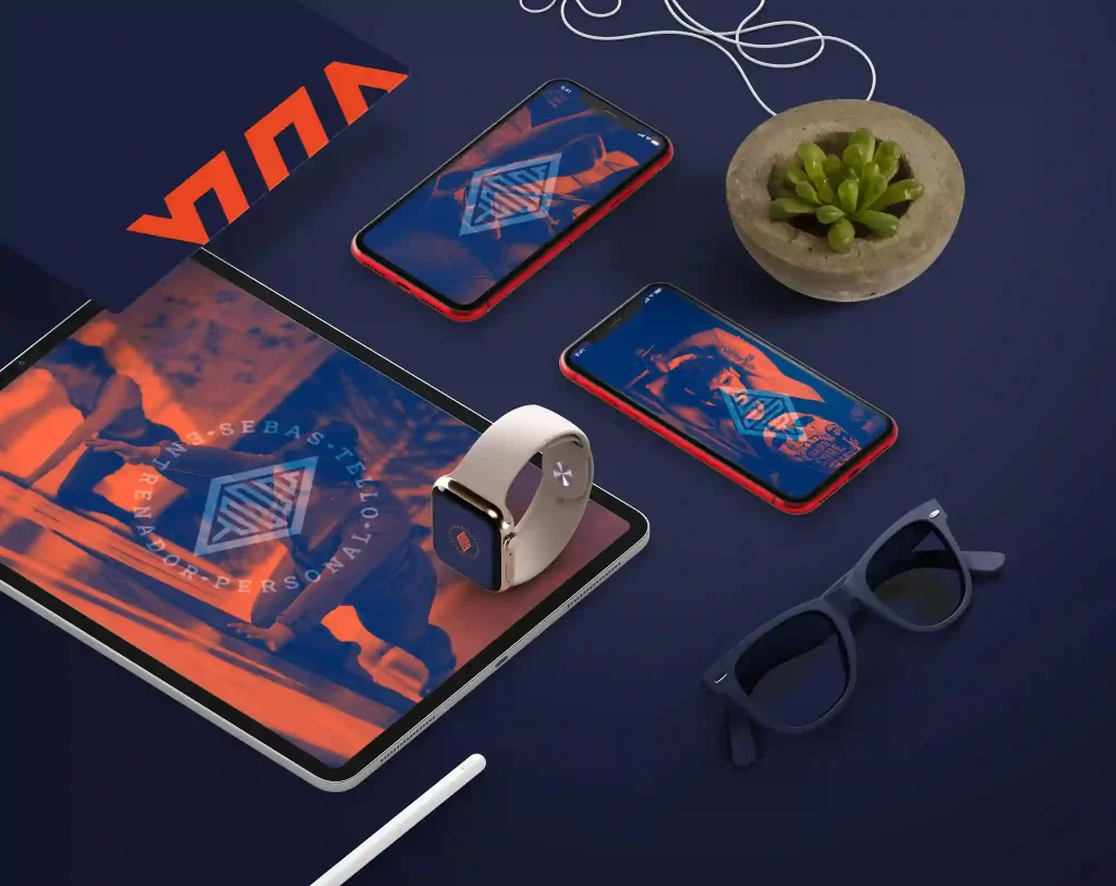
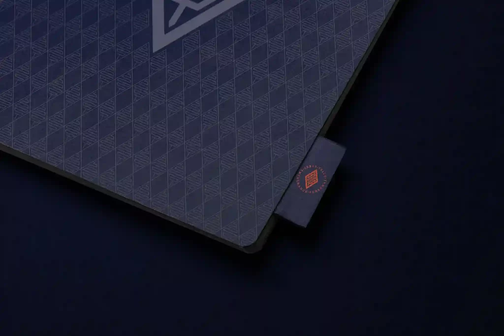

When designing this brand, an authentic strategic profile was found, to redirect efforts to a specific area of the market, managing to work much better, with fewer clients, and charging better for the service.
Since usually the brands in this area are very descriptive. Then the final result consisted of graphically distinguishing a personal trainer from the majority of its competitors. Creating a logo-symbol with an abstract and powerful symbol, which would show experience, passion and efficiency.
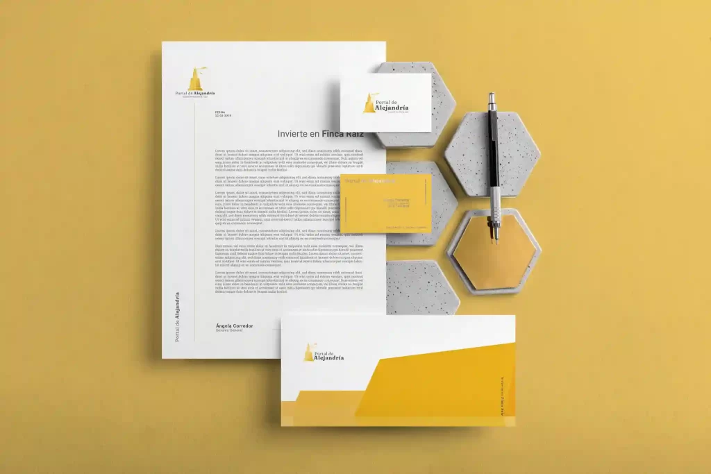
Portal De Alejandria
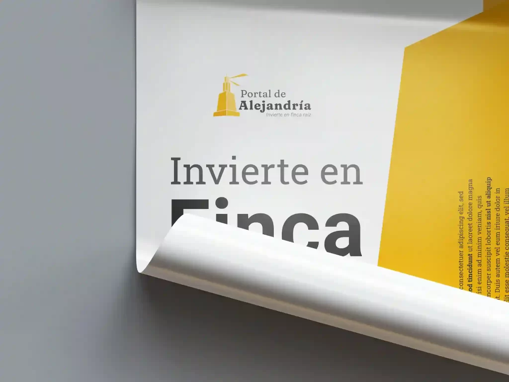
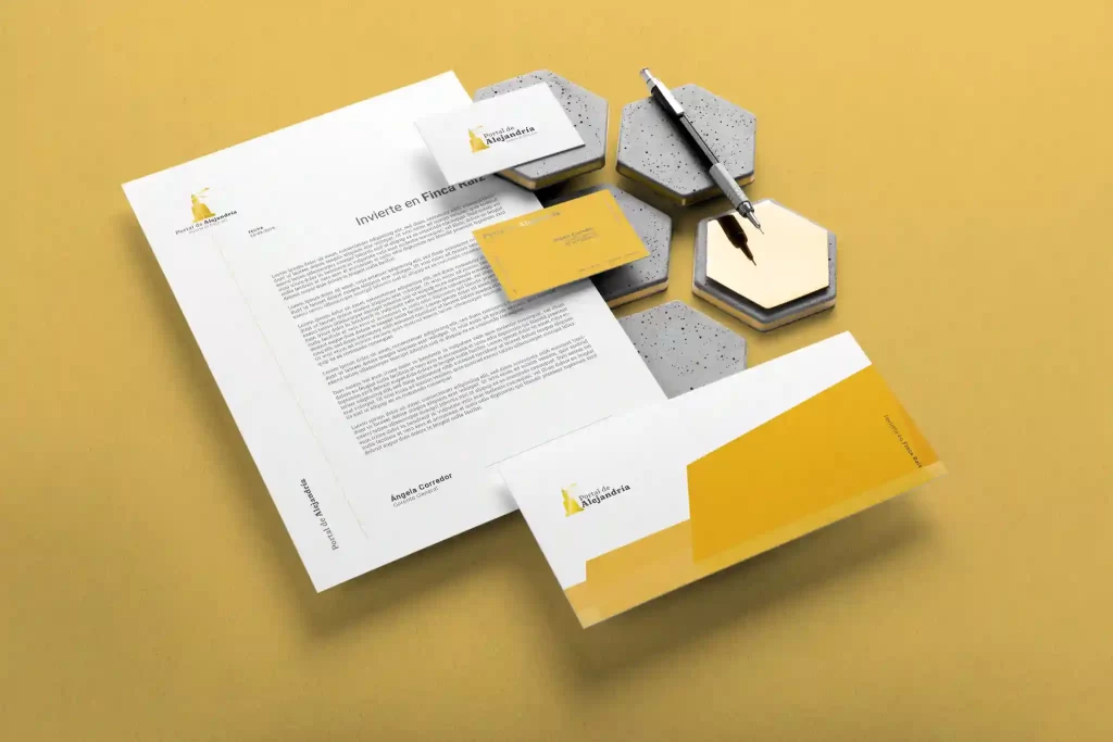
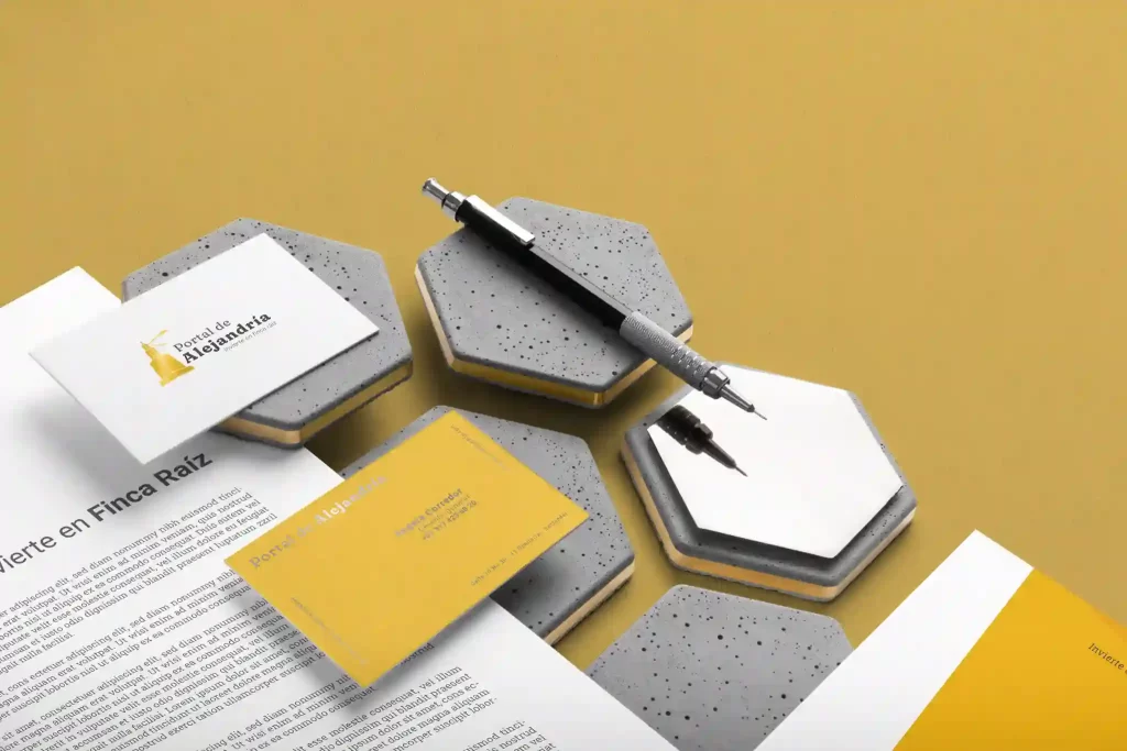
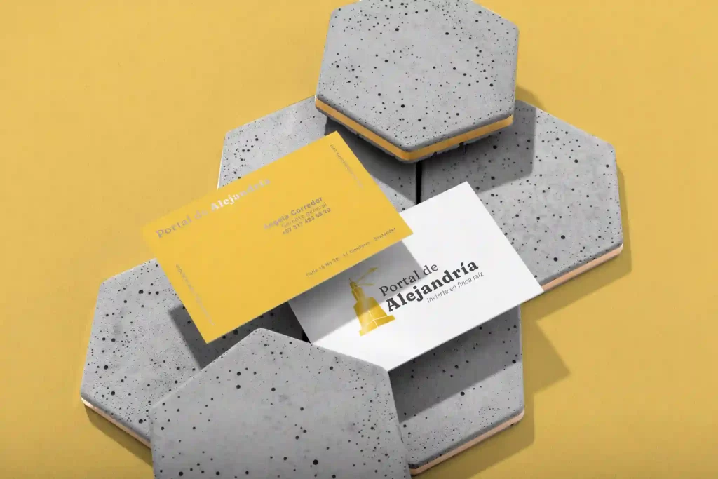
For this company, the geometric design was chosen; polygons with perspective inspired by orthogonal planes and architectural design, to build a strong brand, reflect a good image, experience and knowledge of the professionals behind the project, all accompanied by a strategy of unique branding to publicize the solid foundations of the project and the clear purpose and commitment of the brand to its potential clients.
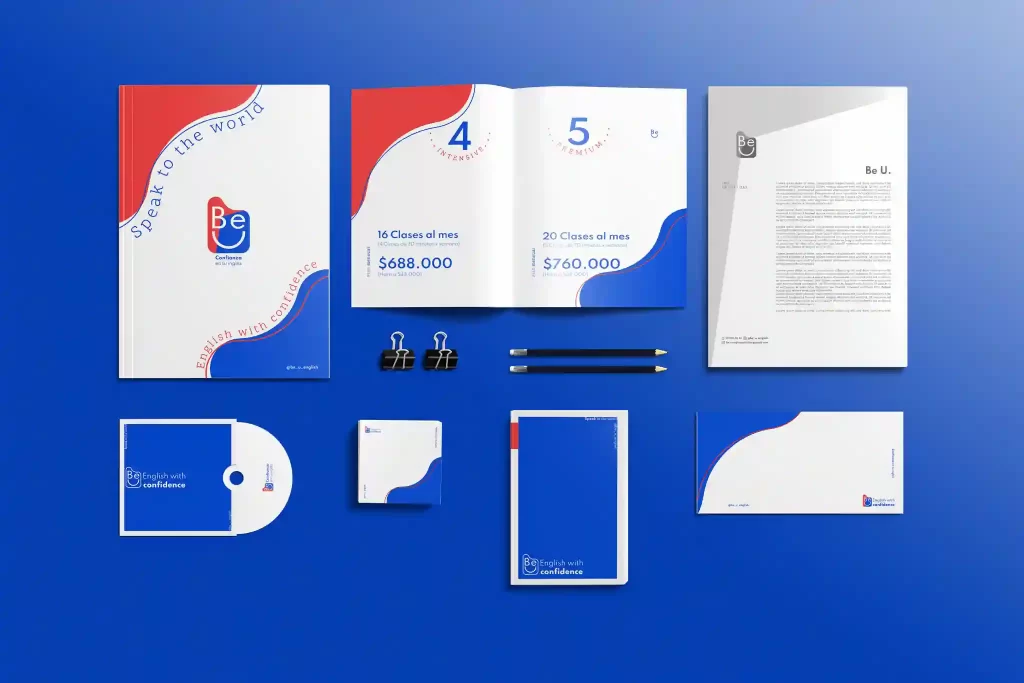
Be u
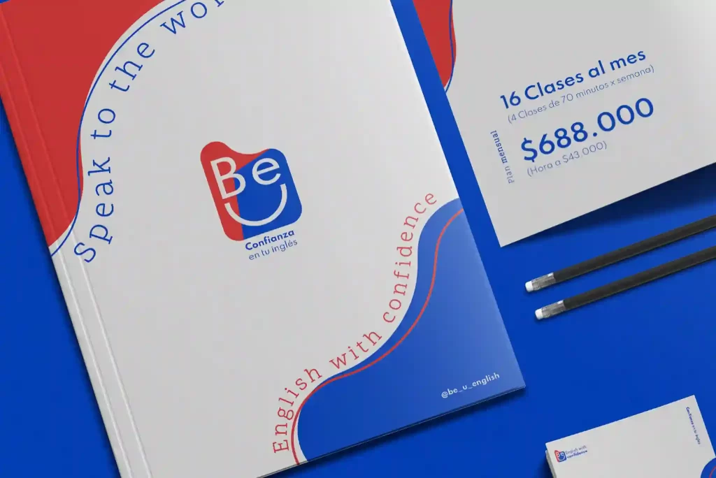
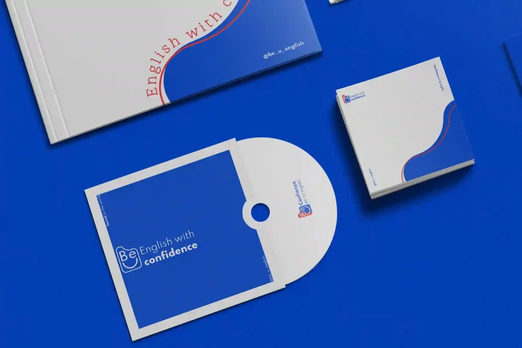
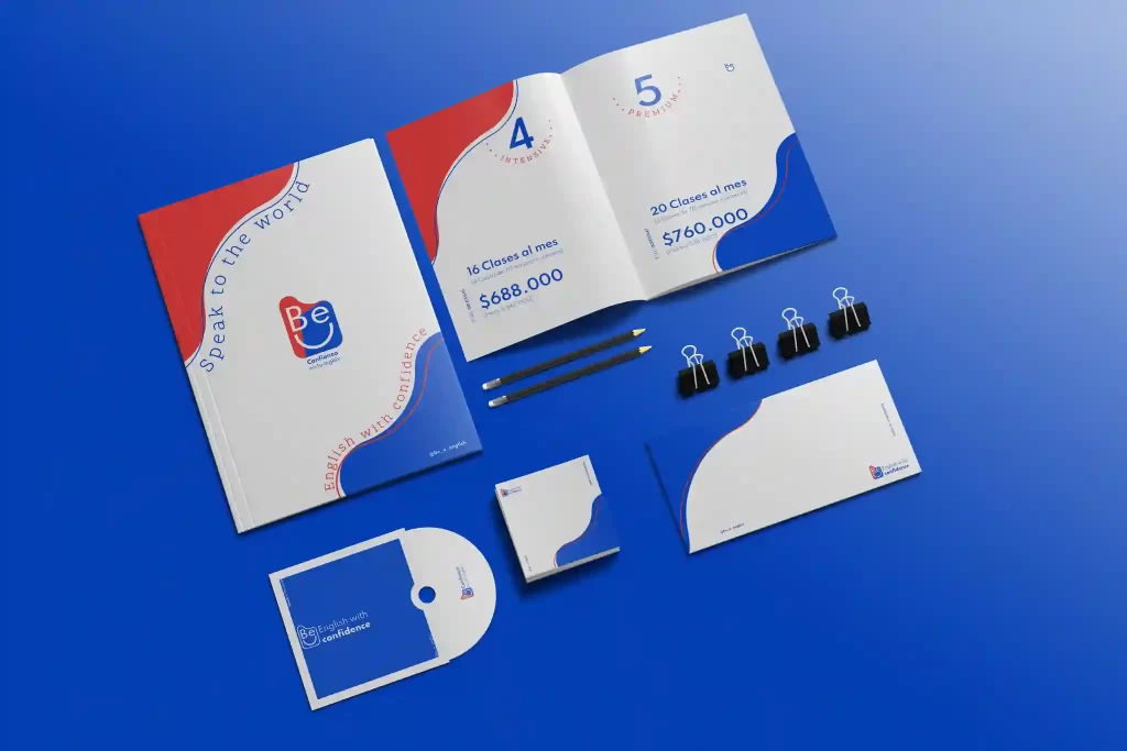
This company only wanted to redesign its logo, and as it had been doing for a few years, it wanted to do everything, and things very similar to its main competitors, but through analysis prior to the design of the graphic brand we discovered that: if you are not different, you end up being cheap.
So, the challenge was to create a brand graphics aimed solely at fluency when speaking the English language, in this way we specialize your strategic profile, define a target audience and with this the value of the service increased considerably.
Corporate Branding
Solcaribe – Tourism Agency